About Hitman
Hitman is a video game franchise that focuses on stealth and smart infiltration, developed by the Danish developer IO Interactive. Square Enix and Eidos Interactive previously published it. Several chapters of Hitman games have been released on many platforms, such as PC, consoles, and mobile devices.
The main protagonist of the series, Agent 47, worked as a former hitman for the International Contract Agency (ICA), which has its own symbol. Agent 47 specifically, however, has his own insignia.

The story behind the Hitman logo
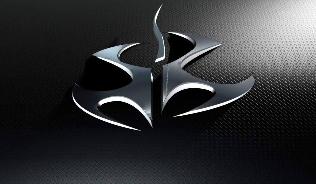
This former Hitman logo became internationally famous for its sublime design since the release of the first Hitman game in 2000. The strong visual identity design consists of two mirroring figures, akin to shurikens which are a large part of a ninja’s vast repertoire of stealth weaponry. Half of the logo is elevated above the left side, indicating assertiveness and power.
In the deeper realms of this seemingly plain logo lies a lily flower in its negative space. Don’t see it? Take another look. Lilies are most commonly symbolic of devotion or purity, which Agent 47 may seem to have in his many disguises.
The origins of the symbol in the Hitman logo and its history remain mostly unknown, save for being associated with Dr. Otto Wolfgang Ort-Meyer, one of Hitman’s five genetic fathers, and Hitman himself, on their belongings. The insignia itself is a laboriously modified “Fleur de Lys”, a stylized lily that is used as a decorative symbol or design, often placed on a casket at funerals. Much dissimilar to its native lily flower, which often appears at weddings. The cross between these two symbols represents a deadly assassin such as Agent 47.

New representation
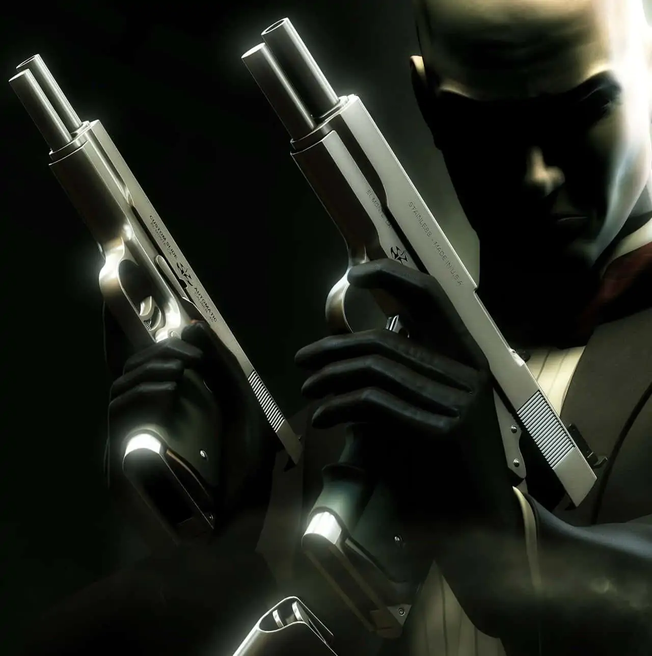
From Codename 47 to Blood Money, countless artwork and wallpapers featured the famous Hitman icon. Everything that remotely belonged to 47 was marked with the logo, such as his laptop, briefcase, and even his iconic weapons. More predominantly, the insignia was present on the cover of each game and was a large part of the marketing for each game.

However, starting with Hitman (2016), IO Interactive elected to separate Agent 47 from his classic Hitman logo and use a more simplistic design. The new minimalistic look of neat sans-serif in a rectangle met a mixed reception from core fans of the franchise. Many liked the nostalgia and symbolism of the old logo. Still, on the other hand, many fans welcomed the change as the former logo appeared to be dated and did not match the direction in which the hitman franchise’s soft reboot was headed.
This new logo boasts its ferocity in its simplicity. “HITMAN” comes off as more of a bold statement than a background afterthought. It feels more personal, like a name tag for Agent 47, representing his power and professionalism in the workplace. The sharp angles and straight, lean letters are all business, no messing around. If the previous insignia represented Agent 47 well, this logo praises a HITMAN title like no other.
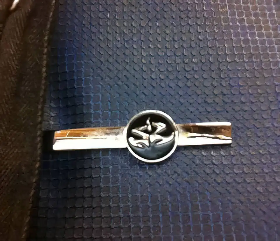
What’s on Agent 47’s tie pin?
If you take a closer look at Agent 47’s tie pin in the new Hitman logo, you’ll notice it’s not the same as his previous one. It is now an outlined “47” instead of the full-fledged Fleur de Lys. This was done to reflect the changes in the series while also paying homage to its roots. This new Hitman logo is clean, modern, and ready to take on whatever comes its way.

The new Hitman logo represents a more stripped-down and focused Agent 47. The baggage of his past no longer weighs him down, but he hasn’t forgotten where he came from. The new logo is the perfect symbol for a new era of Hitman.
Closing thoughts

The Hitman insignia and its history are very interesting, and its new iteration sets a strong direction for the series’ future. Agent 47 has always been a great protagonist, but his original logo often overshadowed his visual identity. Now that IO Interactive has decided to move on from it, we might see more of 47 in upcoming games and less of his old logo. Either way, the new Hitman logo is here to stay, and it’s a great addition to the long line of great game logos.
What do you think of the new Hitman logo? Do you prefer it over the old one? Let us know in the comments!


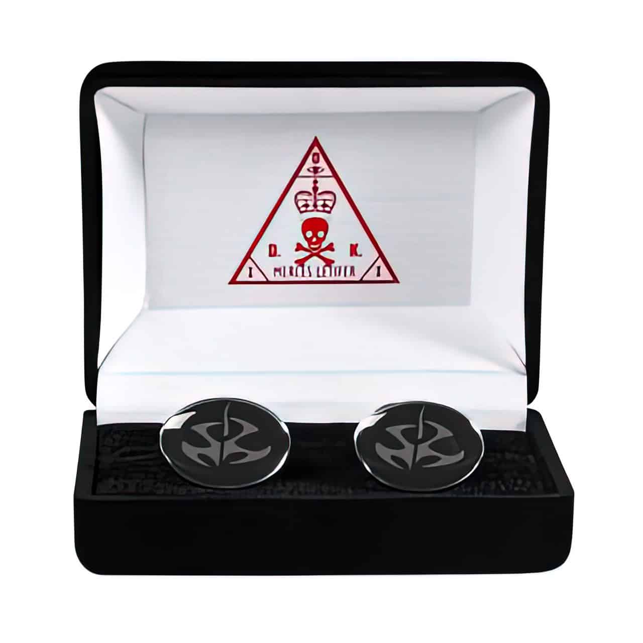
how to order such a cufflinks and tie pin
I’m wondering that too. Would love to get my hands on them.
i’m wondering how i can get the agent 47 briefcase