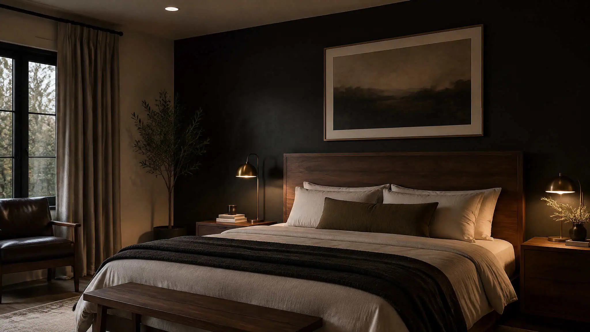
Standing in a half-painted bedroom with five swatch cards taped to the wall is a special kind of stuck. The decision isn’t really about paint. It’s about whether the room looks intentional or becomes one of the two classic failures: the rental white box, or the cave. The way out is picking a style first, then a palette, then testing the actual color on the actual wall. Below are named paints with codes, the pairings that make them work, what’s dated in 2026, and how to check yourself before you buy gallons.
Key Takeaways
Sherwin-Williams Iron Ore (SW 7069) is the off-black worth knowing: deep but warm, best on a feature wall or trim, paired with walnut, oak, brass, and earthy greens.
Mocha Mousse, Pantone’s 2025 Color of the Year, leads the earth-tone shift, with Farrow & Ball Green Smoke and SW Oak Moss as the moody green alternatives.
Ceiling color is the upgrade most guys skip: lift the ceiling a shade lighter than the walls and a small or low-ceilinged room gains apparent height and breathing room.
Table of Contents
Pick the style before the swatch
Style first, then color scheme, then layout, then furniture, then wall decor. Color serves the style, not the other way around. Pick modern, rustic, or minimalist, and the paint decision mostly makes itself. Modern leans toward black-and-white or layered grays.
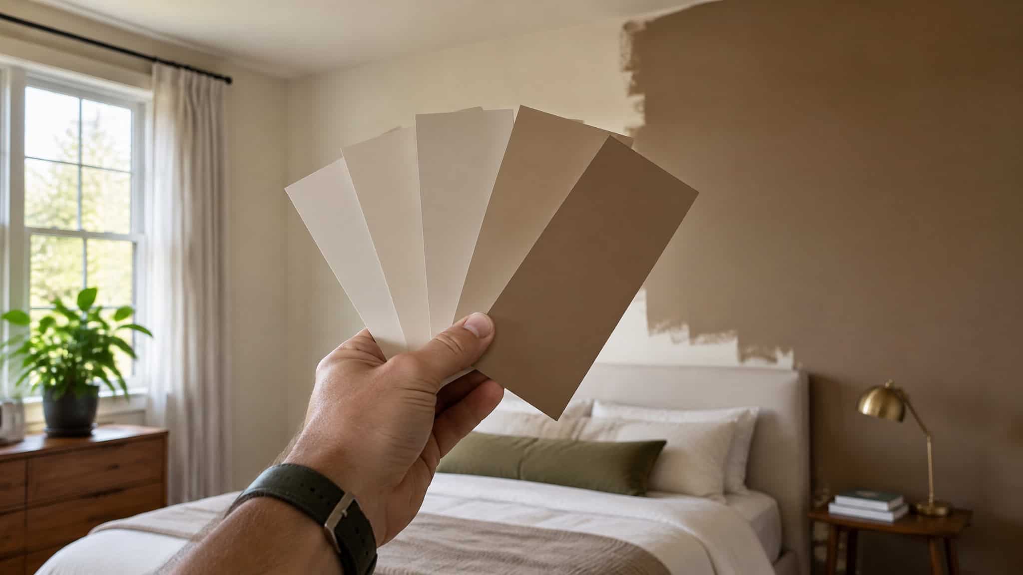
Rustic pulls warm browns and earth tones. Minimalist wants gray-white or off-white with enough texture to keep it from feeling like a waiting room.
The five masculine palette families are the framework the rest of this article fills in:
- Dark and moody, dark gray, green, brown, or black accents with darker bedding. Woodsy and relaxed, not brooding.
- Gray-white, the gentler cousin of black-and-white. Softer edges, same clean look, easier to live with.
- Black-white, the classic base. Modern and sophisticated, and it tolerates almost anything on top: gold or blue accents, wood paneling.
- Warm-cool, warm tones invite, cool tones keep the room from going dated fast. They need each other.
- Light-bright, white walls that only work if the room shows up.
That last one deserves a defense, because white walls get dismissed as boring and the dismissal is wrong. The walls aren’t the problem; the empty room is. A geometric black-and-white rug, a gallery wall with color pops, some plants, and white walls look intentional, not unfinished. Mirrors placed near a light source bounce the room and make a small bedroom feel bigger. Plants add life and clean the air a bit, which is about the lowest-effort upgrade available.
Two supporting decisions make every paint choice easier. First, layout: clear walkable pathways around the bed, the unglamorous step everyone skips. Second, furniture: durable neutral pieces, a low-profile headboard, black, gray, or wood. Buy once, repaint around it later.
The walls can change every few years; the furniture shouldn’t have to. Wall decor comes last and should match what you’re actually into: instruments on the wall, framed movie posters, a nature mural, or faux brick for an industrial vibe. Paint first, posters after, in that order.
There’s real research behind why any of this matters: design researchers Kobayashi and Hatcher found that color influences mood and a room’s perceived size. One warm-and-cool principle to carry through the rest of this piece: warmth makes a bedroom welcoming, and a little cool keeps it current.
Off-black and charcoal: SW Iron Ore, Tricorn Black, and Anonymous
The colors that work best in a masculine bedroom are dark gray, green, brown, and black accent walls paired with contrasting furnishings, and the single best starting paint is Sherwin-Williams Iron Ore, a deep off-black that reads warm instead of flat. Gray-and-white schemes read softer than black-and-white, which matters if you want the dark look without the drama. One caveat: treat dark paint like espresso, balance it with lighter flooring or a white ceiling, and skip the full cave mode if the room doesn’t get natural light.
Iron Ore: the grounding pick
Iron Ore is deep and dramatic, but it has warmth to it, so it anchors a room without going true black. It suits a feature wall, window frames, cabinetry, or trim, places to consider, not mandates. It pairs with walnut or oak, brass, and earthy greens, materials that keep the dark from turning cold.
The caveat: use it like espresso. A shot, not a pot. Balance it with lighter flooring or a white ceiling, and don’t paint all four walls if the room gets little natural light.
Here’s the common failure pattern: a guy sees a photo of a fully dark bedroom that looks incredible, paints all four walls, and then discovers it reads like a cave at night. So he starts overcorrecting with decor, throwing lamps and mirrors at a problem that was decided the day he picked the paint. The tell is choosing the dark color before deciding on lighting and bedding. Deliberate placement (one wall, trim, window frames) is the move. Full immersion is the mistake.
Tricorn Black, Anonymous, and the cocoon family
Beyond Iron Ore, the dark moody family runs SW Tricorn Black, SW Anonymous, deep navy, charcoal, and forest green. Done right, these make a cocoon, not a dungeon, a space that reads considered, safe, intentional, and mature without trying to.
Dark walls with limited light need texture to carry what light can’t: warm metallics, velvet, leather, wood accents, soft lighting, cozy textiles. A dark room without softness feels like a parking garage.
On the charcoal vs. navy accent wall question, the honest answer is it follows the room’s light and furniture. Charcoal reads warmer and earthier, and it plays naturally with wood. Navy runs cooler and crisper. If your room is wood-heavy and warm-lit, charcoal. If it’s clean-lined and you want the room to feel sharp, navy.
One inversion rule ties the whole dark section together: one dark, one light, either direction. Dark walls can handle light furnishings, and light walls can handle dark furniture. What kills a room is dark on dark on dark.
Rich browns: Pantone Mocha Mousse and the earth-tone palette
The best earth-tone bedroom colors right now are Pantone Mocha Mousse, Farrow & Ball Green Smoke, and Sherwin-Williams Oak Moss, which lines up with the 2026 shift toward earthy browns, warm taupes, olive, and chocolate brown. Mocha Mousse was Pantone’s 2025 Color of the Year, described as a warm sensorial brown. In a room it’s grounding, a little indulgent, and reads masculine without trying, exactly the kind of earthy palette for a masculine bedroom that designers keep recommending. It pairs with linen, leather, and raw woods, and it holds its own against deep blues and muted greens.
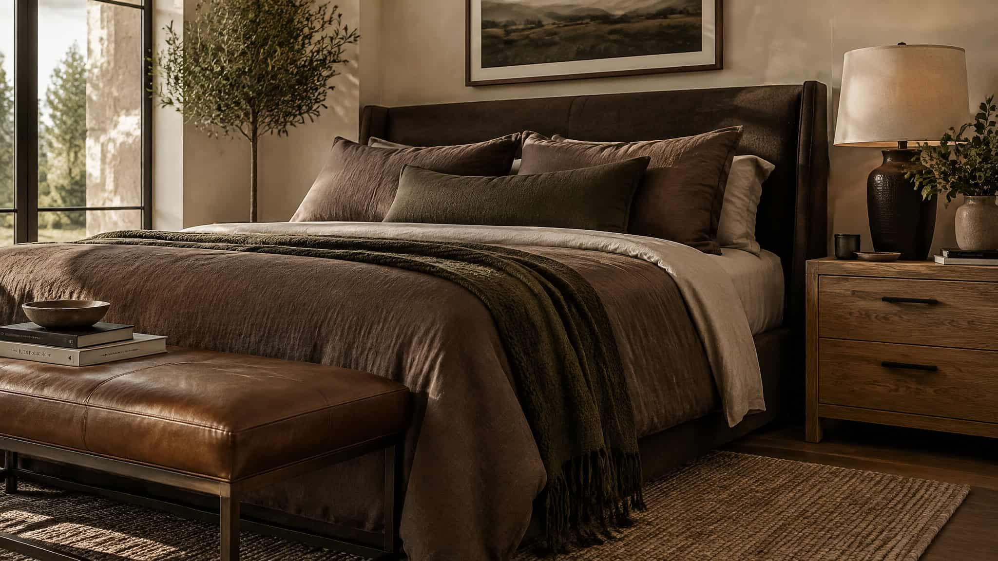
The greens: Green Smoke and Oak Moss with white trim and natural materials read like a masculine spa, the good kind. Muted, moody greens that calm the room without announcing it.
Two Sherwin-Williams picks worth knowing. Neutral Ground is a warm white the brand steers people toward for bedrooms, one that sidesteps the flat rental-apartment look. Willowleaf sits quietly among neutrals while adding a subtle freshening energy; it’s part of the Designer Color Collection, so ask for it by that line. (SW Celestial is a violet. Bold pick, works if you’re comfortable with color, but it’s off-angle for this article.)
Janiece Lonvelin of Velène Design House sees the same direction: dusty whites, soft beiges, warm taupes, deep olive, chocolate brown, warm terracotta, and mineral blue on the way up.
Navy and gray: layered schemes that aren’t dated
Gray isn’t outdated, but cool grays standing alone are declining per 2026 reporting; layered schemes and designer-documented grays still work when warmed with wood and textiles, a principle seen in the best modern masculine rooms, where navy and gray create a specific mood rather than merely playing it safe.
The layered picks
Benjamin Moore’s Color Stories grays Arctic Seal CSP-15 and Perspective CSP-5 pair well together and suit clean modern rooms with straight lines. Randolph Gray CW-85 comes from the Williamsburg Paint Color Collection and was shown in a Charleston, SC show house bedroom that designer Mary Douglas Drysdale walked through.
The objection, answered
Gray-and-white is the gentler cousin of black-and-white, easier to live with, and it fits minimalist, modern, and contemporary rooms, including in a bachelor bedroom design, where muted schemes read calm rather than sterile. Off-whites and soft grays reliably produce a tranquil bedroom, which is the boring-but-correct fallback, and the same hues suit a guest room if you’re painting two. The 2026 reconciliation: the preference tilts warm, so layer in wood and textiles and the gray scheme stays current.
Accent-color math: red, bold trim, and restraint
Placement and dosage matter more than the color. That goes for adding style to a bachelor pad as much as for a single accent wall. One touch of red in an unexpected spot, trim, a single accent wall, or ceiling beams, lands like a punctuation mark, and ox-blood or brown-red beats firetruck red every time; Bear’s colors of the year Rumors and Flirt Alert are the named options. Bold trim runs the same dosage math: navy or teal on the trim frames the space and adds definition, and it works especially well with white or neutral walls. Hale Navy from Benjamin Moore and Vardo from Farrow & Ball are the named shades. The warm-cool balance has a copyable combo too: a half-gray accent wall, chocolate brown bedding, a charcoal throw, and bright white sheets popping against all of it. Whichever way you go, start small: an accent, a piece of furniture, one wall section.
The fifth wall: what color to paint the ceiling
Go lighter than the walls to enlarge a small or low-ceilinged room, or deliberately darker if you want drama. A lighter ceiling is what makes a small or low-ceilinged room read as larger and taller, that’s the whole trick. The rule to remember at the paint counter: ceiling a lighter shade or slight variation of the wall color. Benjamin Moore’s own light-ceiling picks are Summer Shower 2135-60, Beacon Gray 2128-60, and Hollingsworth Green HC-141. For white-wall guys, Smoke 2122-40 on the ceiling over off-white walls gives a hint of sky.
Warm-white options: Farrow & Ball Pointing (warm white with red undertones), BM White Dove, BM Polar Ice if you want cool and crisp, or SW Sequin for something bolder. One multi-color example worth copying exactly: Concord Ivory HC-12 on the ceiling, Metropolitan AF-690 on lower panel insets, Barren Plain 2111-60 on upper panels. It’s the free upgrade most guys skip, and a lighter ceiling can make a room look larger and taller.
Paint techniques beyond the flat wall
Yes, walls and trim can be the same color: same color in different sheens (how flat or glossy the finish is) builds subtle contrast and gives the room a pared-back, Zen-like feel.
Sheen contrast and color drenching
Color drenching is one hue floor to ceiling, in blue, deep green, clay, or soft gray. Keep it from going flat with matte walls, satin trim, and velvet pillows. Benjamin Moore’s Cinnamon Slate is the suggested pick. Say the commitment part out loud: it’s an all-in move, and there’s no half-drenching.
Tonal layering and neutrals with depth
Layer one hue in lighter and darker shades: forest green walls, sage cushions, mint art. SW Cavern Clay is the terracotta-leaning suggestion. And neutrals are made, not born. Philip Thomas’s point, said casually: what a color reads as depends on what it’s mixed with. Warm taupe, creamy greige, and mushroom shades have something going on that flat beige doesn’t.
Painted wallpaper effects
Geometric patterns, color blocking, ombre: all the look of wallpaper, none of the peeling regrets. Stripes are the easiest entry. SW Bane Bronze, a deep moody brown-gray, pairs with peach, sage, and terracotta. There’s also a Benjamin Moore color-expert trick that fakes wainscoting by painting two tones on the wall in wainscoting proportions, no millwork needed, classic look, cheap materials.
What to avoid in 2026, and whether dark colors are out
Deep accent walls can still earn their place in 2026 when they’re planned; the automatic default is what fails.
The dated list
Per 2026 reporting from Good Housekeeping‘s designer panel: icy blues and washed-out pastels will feel dated (Stacy Garcia), cool grays come across as chilly and unwelcoming (per Janiece Lonvelin of Velène Design House), and dusty and blush pink is ending a three-to-four-year run (Anna Tatsioni). Lindsey Jamison cautions that run-of-the-mill deep accent walls in dark blue, forest green, and deep maroon age fast, wear on the eye, and end up fighting the furniture and art sharing the room. These came out of the jewel-box and moody-room trends, so it’s context, not a dunk.
Red flag: A deep accent wall picked because it looked good in a photo, with no plan for lighting, bedding, or furniture. That’s the trend, not a design.
The reconciliation
Yes, dark accent walls are a bad idea when they’re the run-of-the-mill kind, dark blue, forest green, deep maroon slapped on one wall by default. Those date fast, wear on the eye, and end up fighting the furniture and art in the room. Dark colors themselves aren’t out: planned, finish-varied dark treatment, the drenching approach and the Iron Ore placements covered above, holds up past the trend cycle, because the difference is between trend freshness and a room that was actually designed. And if black-and-white feels too stark, the fix is fabric, not paint: off-white neutrals and textured linens. The chronological shape is plain: cool minimalism and jewel-box accents ran through roughly 2025, and 2026 reporting marks the pivot to warm sanctuary hues.
Test before you commit: samples, light, and orientation
Order Samplize peel-and-stick samples, real paint on a sticker, sold via Sherwin-Williams, and check them on the actual wall across morning and evening light before buying gallons. You get to test colors in your space without any mess. The composite mistake is picking a color off a phone screen or a tiny chip, then getting surprised when the wall version shifts by the hour. Real-paint samples prevent most of it. Mind which way the room faces, because light changes how a color reads, and confirm the style choice before you commit.
If you’re going dark, Benjamin Moore Aura Interior is their premium line, positioned for a private sanctuary with rich, lasting color. It costs more, and the reason you’d pay it is that dark colors show flaws, and this is the room you actually sleep in. It matters because color drives mood and perceived spaciousness, which is the whole game.
Frequently Asked Questions
What paint colors work best for a masculine bedroom?
Deep off-blacks like SW Iron Ore, moody greens like Farrow & Ball Green Smoke and SW Oak Moss, and earthy browns like Pantone’s Mocha Mousse all read masculine without trying. The trick is pairing dark colors with warm materials — walnut, oak, brass, leather, and linen — so the room doesn’t turn cold. Gray-and-white schemes work too if you want the dark look with softer edges.
Charcoal vs navy for a men’s bedroom accent wall — which is better?
It follows the room’s light and furniture. Charcoal reads warmer and earthier and plays naturally with wood, so it wins for wood-heavy, warm-lit rooms. Navy runs cooler and crisper, so it’s the pick for clean-lined rooms where you want the space to feel sharp.
How do I choose a color scheme for a bachelor pad bedroom?
Work in this order: style first, then color scheme, then layout, then furniture, then wall decor. Pick modern (black-and-white or layered grays), rustic (warm browns and earth tones), or minimalist (gray-white or off-white with texture), and the paint decision mostly makes itself. Then test real paint samples on the actual wall across morning and evening light before buying gallons.