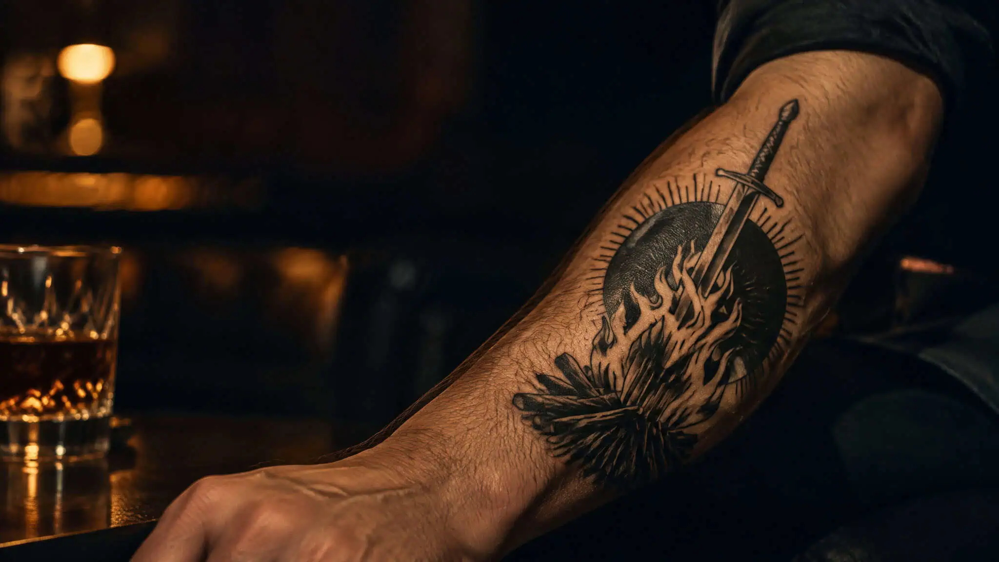
There’s a moment that happens to everyone with a game tattoo, usually about a year in. You’re at a bar, or a wedding, or a pool in July, and someone across the room has the exact same bonfire on their forearm. Same flame treatment, same little sword planted in the coals, same everything. You didn’t copy them.
They didn’t copy you. You both pulled from the same first page of Google Images. Now you’re twins with a stranger.
I’ve got a Transistor tattoo among others, and I’ll say the quiet part out loud: it’s extremely easy to end up with a dumb game tattoo. Not a bad one, necessarily. A dumb one. The kind that felt profound at 2 a.m. during a playthrough and reads like a Philosophy 101 midterm on your body forever.
The fix isn’t avoiding game tattoos. It’s picking a moment, not an icon, and treating these ideas as raw material for a conversation with your artist rather than finished designs to copy off a screen. Tattoo art isn’t a digital medium, even though most artists mock up in design software first. The version on the screen and the version on your skin are different animals, and the screen version always looks better.
Key Takeaways
The Triforce, Pokéball, bonfire, and dark sign are the four most overdone icons in game tattooing; the fix is choosing a deeper lore element from the same franchise instead.
Style and placement should be decided together before the design, a minimalist Triforce on the wrist and a blackwork Soulsborne scene on the forearm are different commitments in visibility and aging.
Bring your artist a brief, not a screenshot: the franchise, one lore element, style and placement, and one twist (reframed composition, combined elements, or a specific playthrough memory).
Table of Contents
The Legend of Zelda tattoo ideas
Let’s start with the uncomfortable truth: the Triforce is the default. A minimalist outline or solid triangle on the wrist or hand is the baseline everyone recognizes, and it’s the one design in this article I’d treat as the one to move past rather than the go-to. It’s not a bad symbol. It’s just the one ten thousand people already have.
The good news is that Zelda has more doors than the one everyone walks through, and each one carries a different meaning. Sort them by the part of the games that actually resonated with you:
- Master Sword. A vertical blade running down the forearm. It reads as the hero’s journey, and the shape does something the Triforce can’t: it uses the limb. A sword wants length.
- Hylian Crest. The bird-and-Triforce crest is a bigger, richer composition than the bare triangle, which makes it the right call for a chest, shoulder, or back piece. If you were going to get the Triforce anyway, this is how you get it without getting it.
- Sheikah eye. This is the fresher route in my opinion. It works small on a wrist, it’s instantly recognizable to fans and mysterious to everyone else, and almost nobody outside the fandom has one. It carries the shadow-self, watch-and-protect meaning of the Sheikah without announcing ZELDA to the whole room.
- Majora’s Mask. An intricate, colorful mask that suits a forearm or calf, and the only option here that carries the mask-era dread instead of the creation myth or the hero’s journey. If what stuck with you was the creepiness and the countdown, this is your design.
One more route worth naming: matching Wind Waker’s cel-shaded look. Matching the art style to the game’s own visual language is a genuinely underused move in game tattoos, and Wind Waker’s bold outlines and flat color translate to skin better than you’d expect.
Pokémon tattoo ideas
If you want a subtle Pokémon tattoo, the answer is a single-line silhouette or a type glyph: it reads as personal without announcing the franchise to everyone in line at the DMV. That’s the direct answer, and it comes with a tradeoff you should hear honestly. Subtle designs hold up better socially, but only fans will recognize them. That’s a real cost, not a footnote. If you want strangers to get it, subtle is the wrong lane.
The subtle menu, roughly in order of how personal it gets:
- Unmarked Pokéball variants. Great Ball, Ultra Ball, the Premier Ball. Fans clock the difference immediately; nobody else does.
- Single-silhouette line art of your starter or favorite. One continuous line, small placement, done.
- Type symbols. Fire, water, ghost. Pick the type you gravitated toward across every generation.
- Evolution-line sequences. Three small marks showing your starter’s line, in order.
- Pokédex-entry numbers. The most subtle option on the list. Your favorite, as a number.
Now the Pokéball problem, because it’s the franchise’s Triforce. A plain red-and-white ball is the single most repeated Pokémon design in existence, and the pattern you see in tattoo communities bears that out: people bring in the same default icon, artists have inked it dozens of times, and the result matches what everyone else walks away with. The alternatives that actually encode meaning are your real team composition from a specific playthrough, or your starter’s evolution line. Both say something about you. The ball says you watched the show.
Full-color character portraits are the other end of the spectrum: loud, fun, and a bigger commitment. Nothing wrong with them, but know which end of this tradeoff you’re standing on before you sit down in the chair.
Dark Souls and FromSoftware tattoo ideas
This is the franchise where the repetition problem is most acute, so the bonfire and the Dark Sign are the overdone defaults. The dark sign specifically gets requested by name in tattoo-community comment threads, which tells you how much demand there is, and the bare sign is thin on its own. Here’s the tell of an overdone icon: when you flip through an artist’s portfolio, their versions all look near-identical. If every dark sign in the book has the same ring detail and the same flame treatment, you’re ordering off the menu.
The deeper anchors:
- Estus flask. Warm colors, simple silhouette, and it carries the “this is how I survived” meaning instead of the “this is how I died” one.
- Covenant emblems. Way less common than the bonfire, and it says which kind of player you were.
- Boss-specific imagery. Ornstein and Sif, Artorias, the Soul of Cinder. A boss you beat after forty attempts means something a menu icon never will.
- Item descriptions as script. FromSoft’s item text is the best writing in the genre, and a short line in script lettering is a quote tattoo that won’t feel like one.
Elden Ring and Bloodborne belong in the same conversation because they’re the same family: grace-guidance lines for Elden Ring, the Hunter’s Mark for Bloodborne. Same rendering logic, same lore depth, same warning about defaults.
And to be fair to the dark sign: artists do vary the composition. Ring detail, flame treatment, the texture of the brand itself. Two dark signs don’t have to look the same. But that variation only happens if you ask for it, which is the whole point of section seven.
Mario franchise tattoo ideas
The Mario icon set is simple: mushroom, star, pixel sprites, warp pipe. That simplicity makes it the perfect live demonstration of how style changes everything, so let’s run the demo. Take the same mushroom and render it three ways:
- Minimalist linework. Clean single-weight outline, small placement, reads modern and understated. The mushroom becomes a shape.
- Neo-traditional. Bold lines, saturated color, decorative shading. The mushroom becomes a piece of art with weight and presence.
- Traditional. Thick black outlines, limited classic palette, the old flash-tattoo language. The mushroom becomes a sailor’s souvenir that happens to be from the Mushroom Kingdom.
Same icon, three completely different statements. That’s why the style choice is a meaning decision, not just an aesthetic one, the same logic behind matching gaming tattoos for couples, where the design has to carry a relationship, not just a reference. It’s also the quiet answer to how do I get a Mario tattoo that isn’t cheesy or childish: whether a Mario tattoo reads as adult comes down to style. A neo-traditional or blackwork mushroom reads like a deliberate piece. A clip-art sprite pasted on the calf reads like a sticker.
Pixel-art takes a specialist, which matters double if you’re building toward a full gaming tattoo sleeve where the pieces need a cohesive theme. More on that in the artist-fit section, but don’t let a generalist freehand your 8-bit sprite.
Halo and sci-fi shooter tattoo ideas
Sci-fi shooters work best as insignia and silhouette designs rather than colorful icon work. Helmet outlines, Spartan emblems, UNSC-style badges, weapon references. That’s a different rendering logic than Mario or Pokémon: you’re going for military-crest energy, not cartoon color, and the design should look like it belongs on a unit patch.
Scale and placement matter more here than anywhere else in this article. Helmets and armor need canvas area for shading, so a small wrist placement starves them. A half-shaded Spartan helmet the size of a matchbox looks like a smudge. The answer for smaller spots is the emblem-only version: the insignia carries the identity without needing the shading real estate.
This section is shorter than Zelda or Souls because the franchise has less lore depth to mine, and pretending otherwise would be filler.
How style and placement change a game tattoo
This is the decision most people make backwards. They pick the icon first, then the style, then whatever spot is left on their body. Decide style and placement together, before the design. A minimalist Triforce on the wrist and a blackwork Soulsborne scene on the forearm are different commitments in meaning, visibility, and aging, even though both are “Zelda-adjacent” in spirit.
The three main style lanes:
- Minimalist linework. Simple shapes, small scale, low commitment visually. Best for symbols like the Sheikah eye or a type glyph.
- Neo-traditional. Bold lines, saturated color, holds its shape for decades. Best for character work and anything from Mario’s icon set.
- Blackwork and realism. Dense black, heavy shading, scene-capable. Best for large pieces like a Soulsborne boss or a Halo helmet.
The placement rule is simple: a wrist or hand suits simple shapes, and a forearm has room for a blackwork scene. Don’t put a scene where a symbol belongs or a symbol where you wanted a scene.
| Style | How it ages | Best use |
|---|---|---|
| Fine line | Blurs over time | Small symbols only |
| Minimalist linework | Holds if lines are bold enough | Wrist, hand, small icons |
| Neo-traditional | Holds well, color stays saturated | Character pieces, medium to large |
| Blackwork | Holds best of any style | Forearm scenes, large pieces |
| Hyper-detailed small realism | Blurs fast, detail collapses | Honestly, skip it |
That last row is the “what ages badly” answer, stated plainly: thin fine-line work and hyper-detailed small pieces are the honest answers. Fine line blurs because thin lines sit shallow and spread under the skin over the years; bold blackwork holds because the ink load is heavier. A tiny photorealistic bonfire is a bonfire-shaped blur in a decade. A bold one is still a bonfire.
How to avoid the generic icon everyone else has
Here’s the failure pattern, and you’ve probably seen it: someone brings in a plain Pokéball or plain Triforce, the artist has drawn it dozens of times, and everyone in the transaction knows exactly how it’s going to turn out. Identical to the last one. The fix is arriving with one twist, and there are three moves that work:
- Reframe the icon’s composition. Don’t center the Triforce in a circle. Break it across the shoulder blade, tilt it, crop it, let it run off the edge of the piece. Same symbol, new geometry.
- Merge two lore elements into a single design. The Master Sword piercing a bonfire. The Sheikah eye weeping an Estus flame. Crossovers inside a franchise are almost never taken, and they’re automatically yours.
- Show a scene from a specific playthrough memory rather than the bare symbol. The first time you saw the sky in Anor Londo. The moment the credits rolled on your first run. A scene is a memory; an icon is a logo.
Even tattoo artists hit that wall when an icon is overdone. A 52-minute video on a tattoo-focused channel, titled How to Keep Drawing When You Don’t Know What Comes Next, tells you the craft side of that struggle is real. You’re not the only one staring at a blank space after the bonfire.
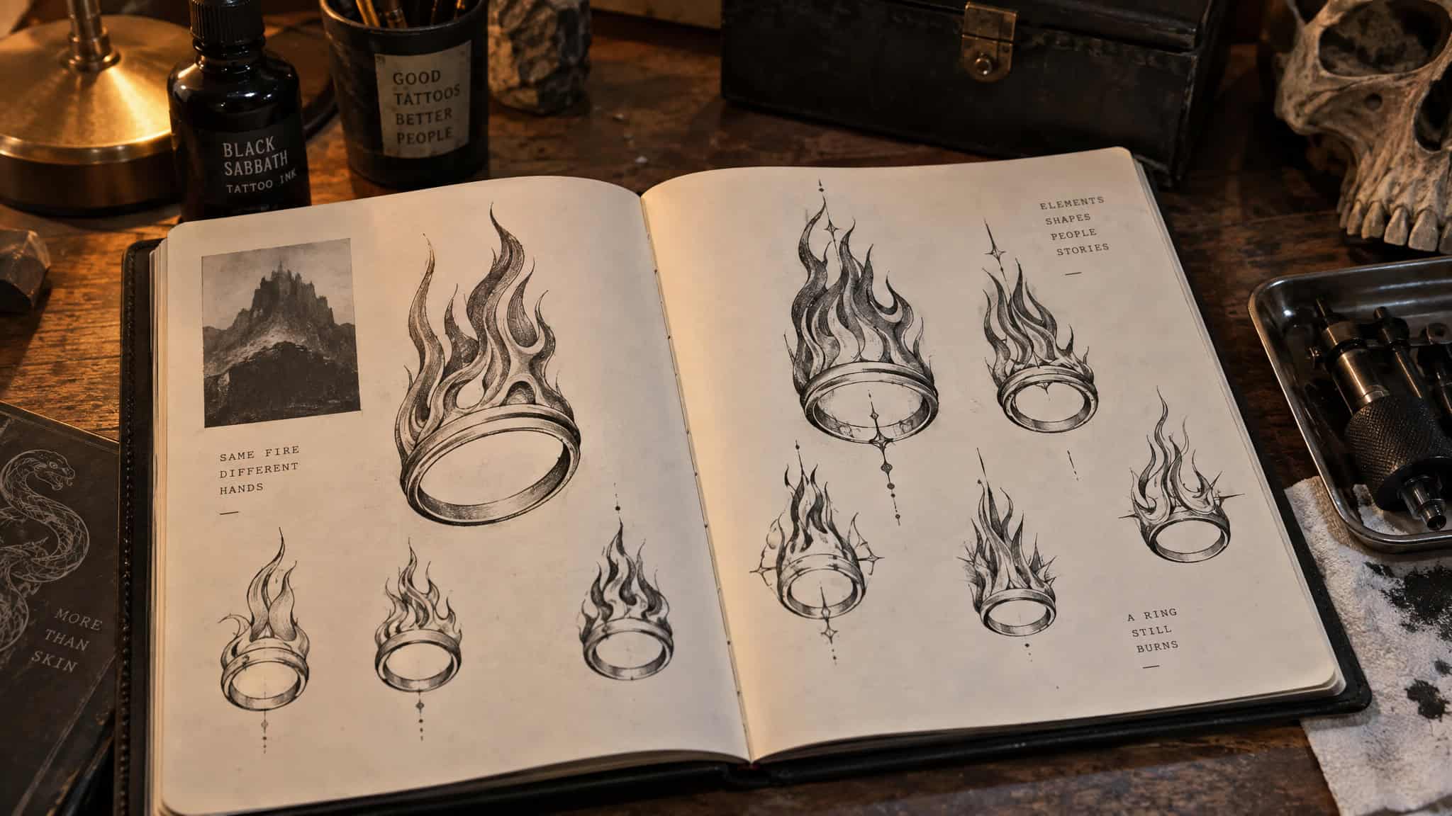
The artist-fit point lives here too, because it’s part of the same decision. Pick the artist for the style, not just any artist for the idea. Pixel art in particular needs a specialist: it may look amazing in an artist’s rendering, but unless you’re working with someone like Youthless, the globe-trotting artist known for vividly colored retro-inspired pieces, it doesn’t always carry over well to skin. The same goes for intricately detailed work and spit-shading.
Bonus points, not requirements, if the artist actually knows your favorite games. And the nice-to-have that’s real: understanding the game on a gut level, not just knowing the characters, is what separates a tattoo that means something from one that’s just a logo.
BioShock is a competent shooter, headier and more introspective than the genre usually gets, and its themes tempt people into tattoos that can come off pretentious. That’s all I’ll say about that. You know the tattoo I mean.
Video game tattoo ideas for women
Franchise tattoo galleries lean male in their framing, and one woman commenting on a gallery aimed at men pointed out that the content excludes her. That’s a documented gap, not a hypothetical. The claim here is simple: every design concept in this guide is about the franchise, not gender.
Placement, scale, and style are what vary, and galleries that assume one body type are leaving readers out. Every placement listed above works on any body, full stop.
From idea to artist brief
So here’s what you walk into the consultation with: the franchise, one lore element, style and placement decided together, and one twist. Four things. That brief is what makes a game tattoo personally earned instead of copied, and it’s the difference between the artist lighting up and the artist sighing and opening the file they’ve opened forty times.
The quiet last worry: what if you stop playing the game later? A design anchored in a specific moment or meaning tends to hold up better than a logo, because you’re not tattooed to the franchise, you’re tattooed to what it gave you. That’s the whole argument of this article, and it’s the last sentence I’ll spend on it.
Frequently Asked Questions
How do I get a Mario tattoo that isn’t cheesy or childish?
Whether a Mario tattoo reads as adult comes down to style, not the subject. Pixel art is one route, but it takes a specialist artist — it can look great in a rendering and fall apart on skin if your artist doesn’t know the technique. Pick the artist for the style first, then bring them a brief rather than a screenshot.
Where should I place a small video game tattoo on my body?
It depends on the design’s shading needs. Intricate pieces like Majora’s Mask suit a forearm or calf, the Sheikah eye works small on a wrist, and the Hylian Crest needs the canvas of a chest, shoulder, or back. Helmets and armor-style designs starve on small spots, so for limited real estate, go emblem-only.
What video game tattoos age badly or look dated over time?
Thin fine-line work and hyper-detailed small pieces are the honest answers — they’re the styles that hold up worst. Bold, simple designs age best of any style; a bold one is still a bonfire, but it stays legible. This is another reason to decide style and placement together before committing to a design.